Sang Hee Yun
Sang Hee Yun studied jewellery at Seoul National University, then specialised in The Dept. of Ottchil-Art at PaiChai University. Since then she has exhibited her work in a number of solo and group exhibitions.
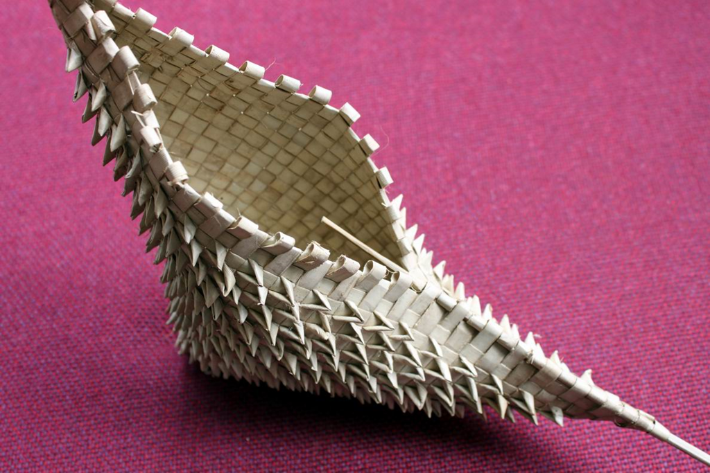
Sang Hee Yun has extended the craft of Ottchil to create striking body ornament. Korean culture has developed the art of lacquer to extraordinary sophistication, and Sang Hee Yun demonstrates who it can also be used for artistic purposes.
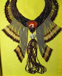
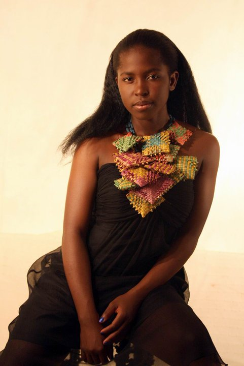
Her work for Welcome Signs can seem contrary to the ethic of hospitality. It is designed to repel, rather than attract. But as something that offers protection, it indicates the broad range of meanings associated with neck wreaths in the Asia Pacific region.

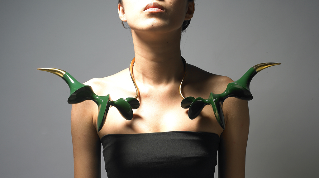
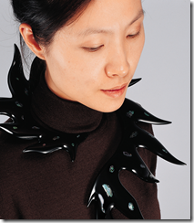
Sang Hee Yun 'An attack by green horns' Wood, Ottchil, 925silver, gold-plating, gold-leaf, 572 × 249 × 74 mm, 2009
Artist Statement
The main concept of this Ottchil Ornament is an image of attack and protection.
In order to manifest it, I took out its materials from nature, inducing a variety of formative experiments by applying Ottchil (Asian lacquer) with the material characteristics of outstanding durability and moth protection to jewelry.
The purpose of this Work is to attempt to provide the women alienated from the society under the extreme circumstances such as threatening situation, horror, and sorrow with power by making accessories to make a use of varnishing with lacquer that has an offensive character and a defensive function; to grope for the new try to search for beauty by giving the experimental characteristics to the positions on which accessories are put in the relationship between the body and accessories as well.
This work had been started from the process of utilizing varnishing with lacquer positively. I used varnishing with lacquer in making accessories not only because I could include an environment-friendly defensive concept along with its perpetuity that could keep accessories from decay and deformation after a long time, but also because the property of matter of varnishing with lacquer was accorded with my concept of making accessories in many ways.
The sizes and colors of accessories had been very important to deliver the offensive and defensive feeling, and so I could solve that with the production techniques of varnishing with lacquer to use light materials such as paper, wood, cloth, and etc.
My jewelry makes the wearers get the strong existential feeling and sexual power from the mutual communication with others through wearing action; desires them to restore their mental tranquility and subjectivity.
I aspire that this could be not only a means to exist as an individual whose own values are not penetrated and but also a cry that the weak existence wounded by the outside can express with his or her body within the diversity in the modern society.

")

 rosewood and brass, 2010")

")

")

")

, 2010")


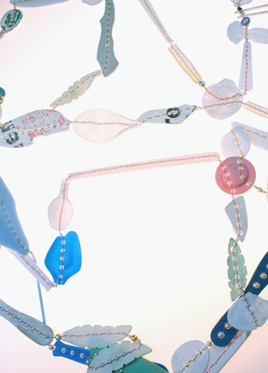
' 490 recycled communion cups, fresh water pearls, 18ct gold, Gold plated sterling silver, stainless steel, 2008, 260cmL x 8cmW x 3cmH, photograph by Jeremy Dillon")