Anastasia Sulemantoro, Annisa Fardan Nabila, Aulia Amanda Santoso, Emeraldi Kumastyo Paramaeswara and Maria Yosepha
Palapa is the joint effort of five product design students from Bandung Institute – Anastasia Sulemantoro, Annisa Fardan Nabila, Aulia Amanda Santoso, Emeraldi Kumastyo Paramaeswara and Maria Yosepha. Their idea of transforming a traditional myth into a gift emerged from the Transforming Tradition Workshop by Mr. Adhi Nugraha in September 2009.
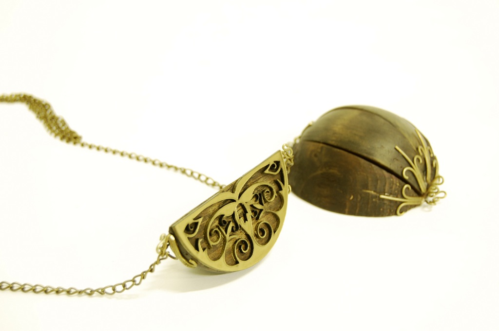
We know the nutmeg as a spice that drew the Dutch to Indonesia and provided the Dutch East Indies company with much of its wealth, at the cost of many lives. Using carved rosewood, these young designers have now recovered the nutmeg as a symbol of Indonesian unity.
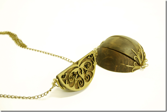
Palapa by Anastasia Sulemantoro, Annisa Fardan Nabila, Aulia Amanda Santoso, Emeraldi Kumastyo Paramaeswara and Maria Yosepha (etched brass is made by Kriya Nusantara) rosewood and brass, 2010
Their statement
PALAPA begins with the concept of "giving" as it is an Indonesian people nature to give. It is reflected in many Indonesian tradition and lifestyle, from daily activities, to ritual and religious ceremony. Furthermore, it is a common thing for Indonesian to bring gift for closest people, like family and friends after their trip to foreign places.
We choose jewelry as a gift object to be developed, as jewelry is a product designed for exposing itself, and has an ability to create interaction between the user and others using its attractive visual appearance.
The basic form of PALAPA is a sphere sliced into eight pieces. Since sphere has neither front nor backside, dominant wouldn’t exist as all sides are equal.

The eight amount itself comes from eastern spiritual philosophy based on eight wind direction, which also represents eight ethnic group existing in Indonesia based on isle groups and islands in Indonesia; Sumatra, Java, Borneo, Celebes, Nusa Tenggara, Bali, Moluccan, and Papua. Each piece expresses the uniqueness of every ethnic group in every island, which is visually represented by its traditional decorative pattern.
As we collected images of Indonesia from all provinces, a combination of brown and golden shade dominate, which underlies us to make the choice of material; rosewood and golden metal.
Traditional pattern metal attached to wooden piece represents every ethnic group is unique, special and has their own characters. This pattern variation will enable people to choose which one represents them best.
Back to the main concept of giving, here every piece is meant to be given to closest persons as a gift from one who has bought PALAPA from Indonesia. Here, the act of giving will make a personal expression in both of the giver and the given one.
The basic structure of PALAPA is to unite all the pieces in one unity, which is a metaphor to Indonesia motto; Bhinneka Tunggal Ika (Instead of the differences, stay the unity). Every single piece represents uniqueness and diversity, whereas all the eight pieces are combined, a solid sphere will be formed. It represents unity, since a solid sphere wouldn’t be formed when apiece is missed.
PALAPA pieces are made from rosewood with the traditional pattern shaped metal attached on it. When apiece stands alone, adornment beauty shimmers with sparkle of the metal, yet a sweet humble brown appears when all the pieces are combined, philosophizing; to form a unity one have to forbear one’s ego to accept others.
It is all connected with the naming of PALAPA itself. The word PALAPA comes from Sumpah Palapa from Patih (vice regent) Gadjah Mada who has swore not to eat palapa fruit (nutmeg) before he could unite Nusantara – a term used by Indonesian people to define Indonesian archipelago.
Briefly, PALAPA isn’t only about a gift, or jewelry, but a message for Indonesia and world that together we should advance unity despite of our egos.
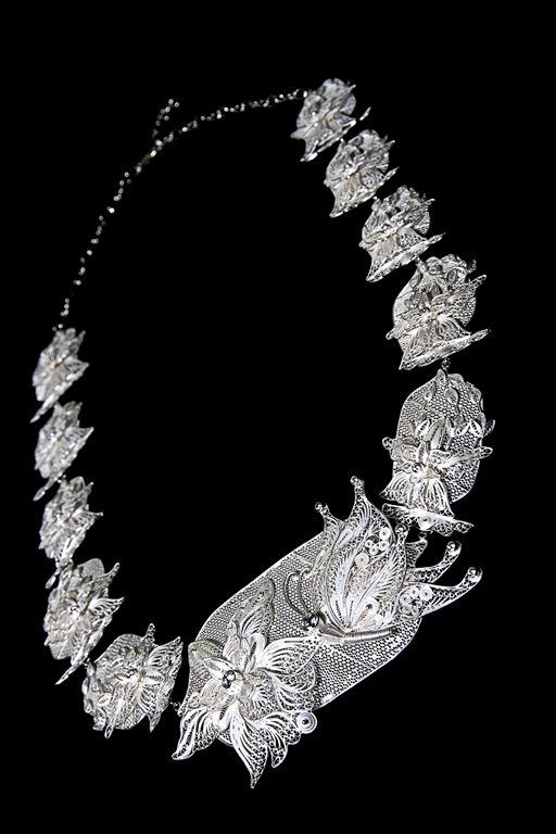
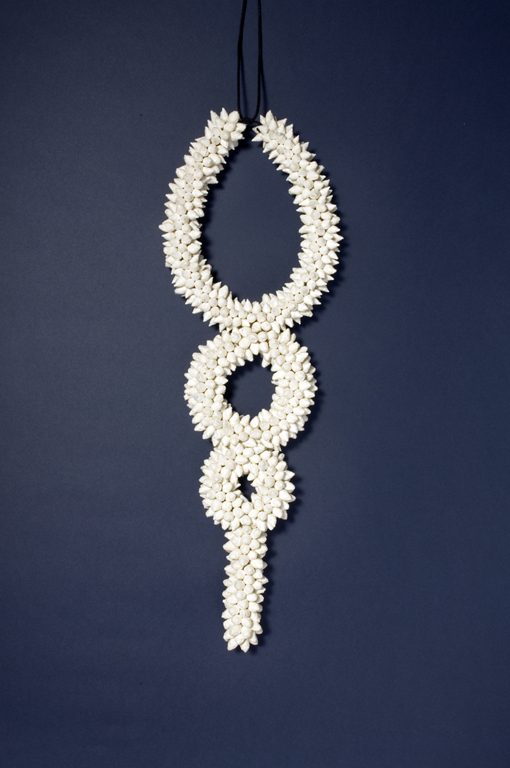
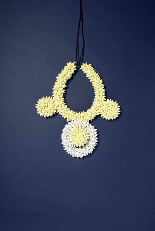
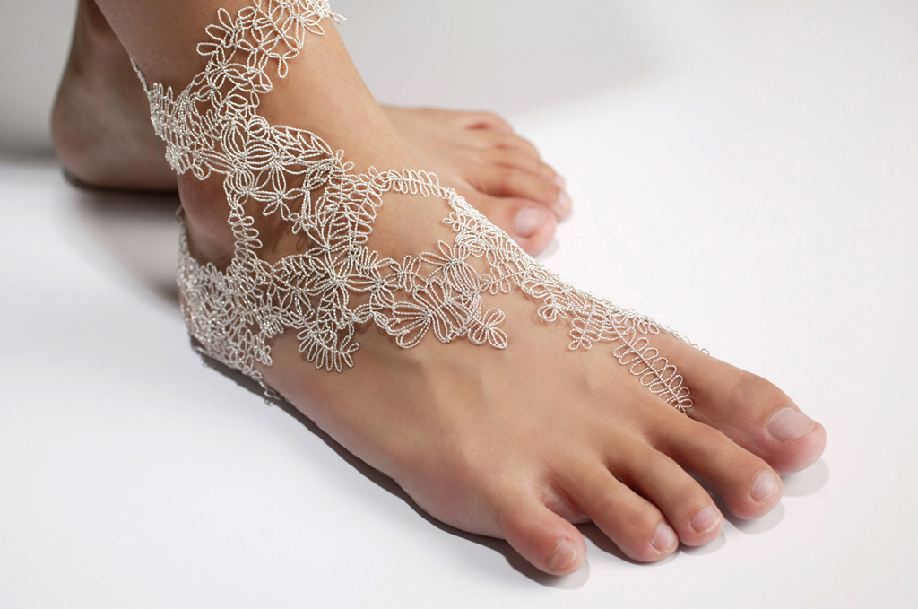
Palapa is part of the Welcome Signs exhibition. It reflects the way in which jewellery in the Asia Pacific is drawing inspiration from traditions involving organic materials.